DBF Neighborhoods
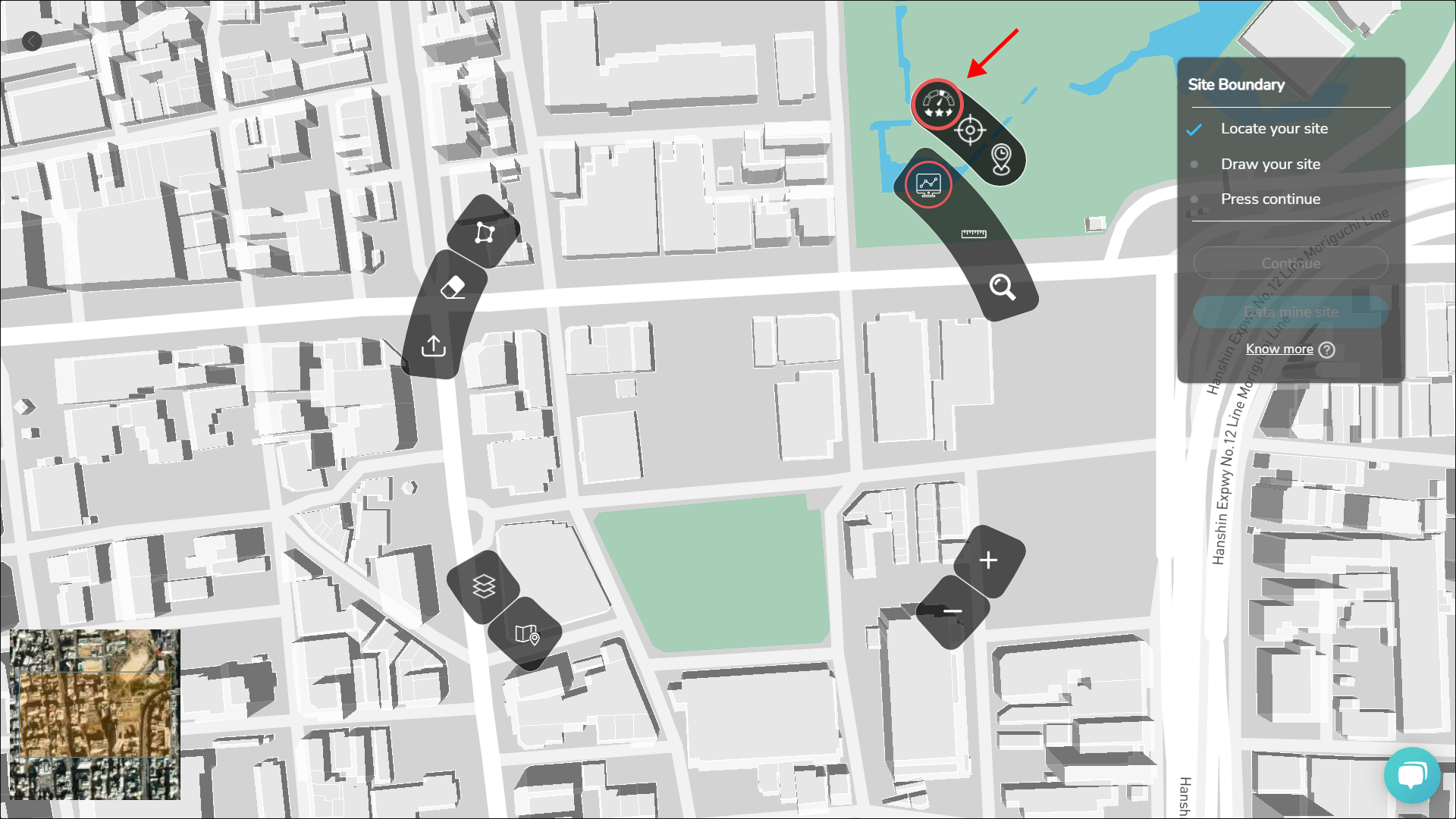
Once you have searched for your site location in the dashboard, and you are in the Map page now, To understand the quality of neighborhoods, click on the Neighborhood Analysis button and select this option for macro-level neighborhood analysis.


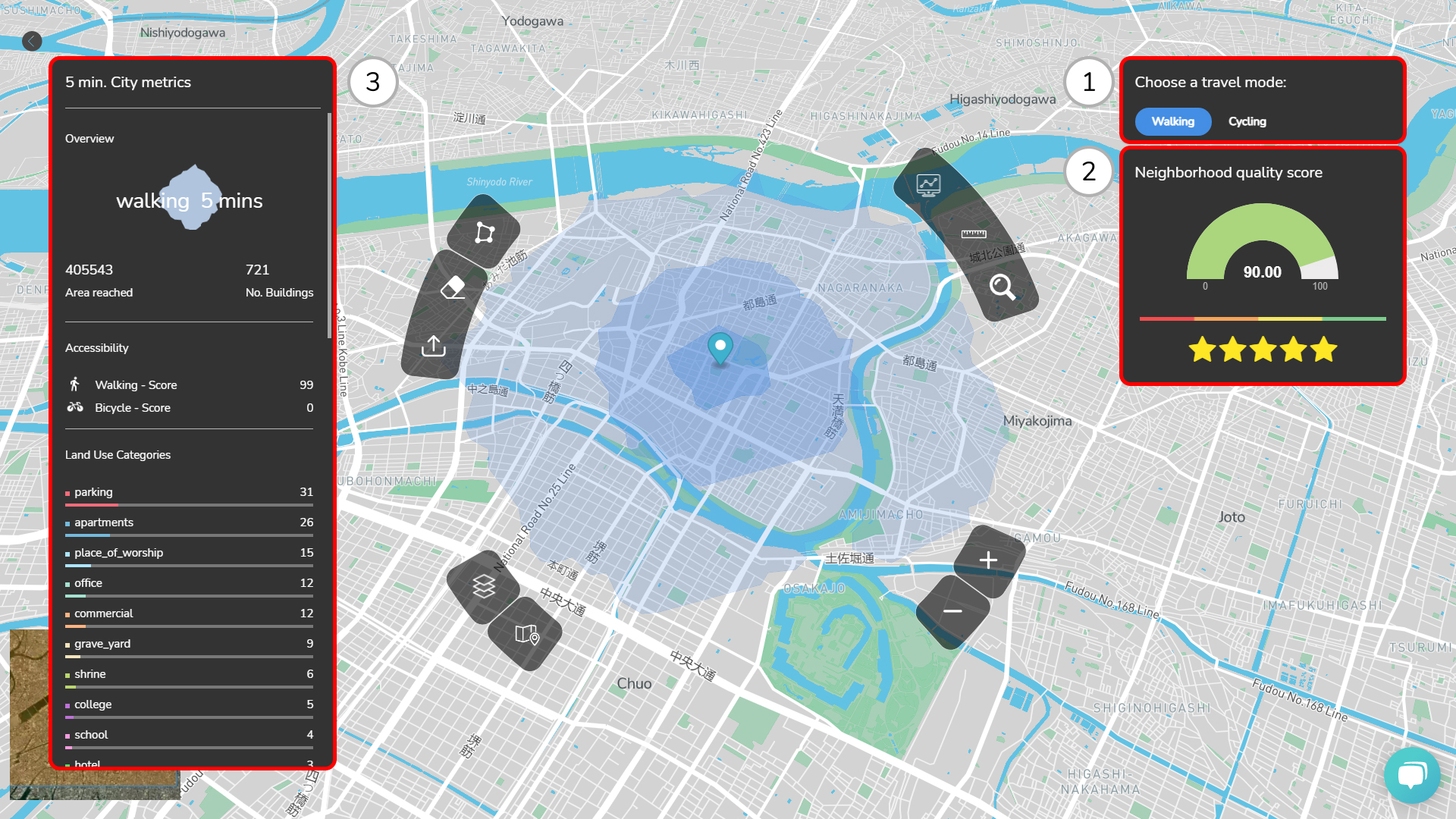
1. Isochrone based on Travel Modes
You can visualize 3 isochrones, 5 mins, 15 mins and 30 mins Isochrones based on the travel model selected. You can also switch between Walking and Cycling as travel modes.
2. Neighborhood Quality Score
You can perform and visualize neighborhood score analysis on different sites. The score ranges from 0-100, with 100 being excellent. The quality of the neighborhood is evaluated based on land use mix and walking accessibility to local facilities.
3. City Metrics
This panel helps you visualize and analyze the 5/15 min city metrics. You can study various aspects of the particular neighborhood, like
- No. of Buildings
- Accessible Area with walking/cycling
- Accessibility Score (Walking and Bicycle)
- Land Use Categories
- Diversity Score
- Building area distribution and Height Information (with statistics)
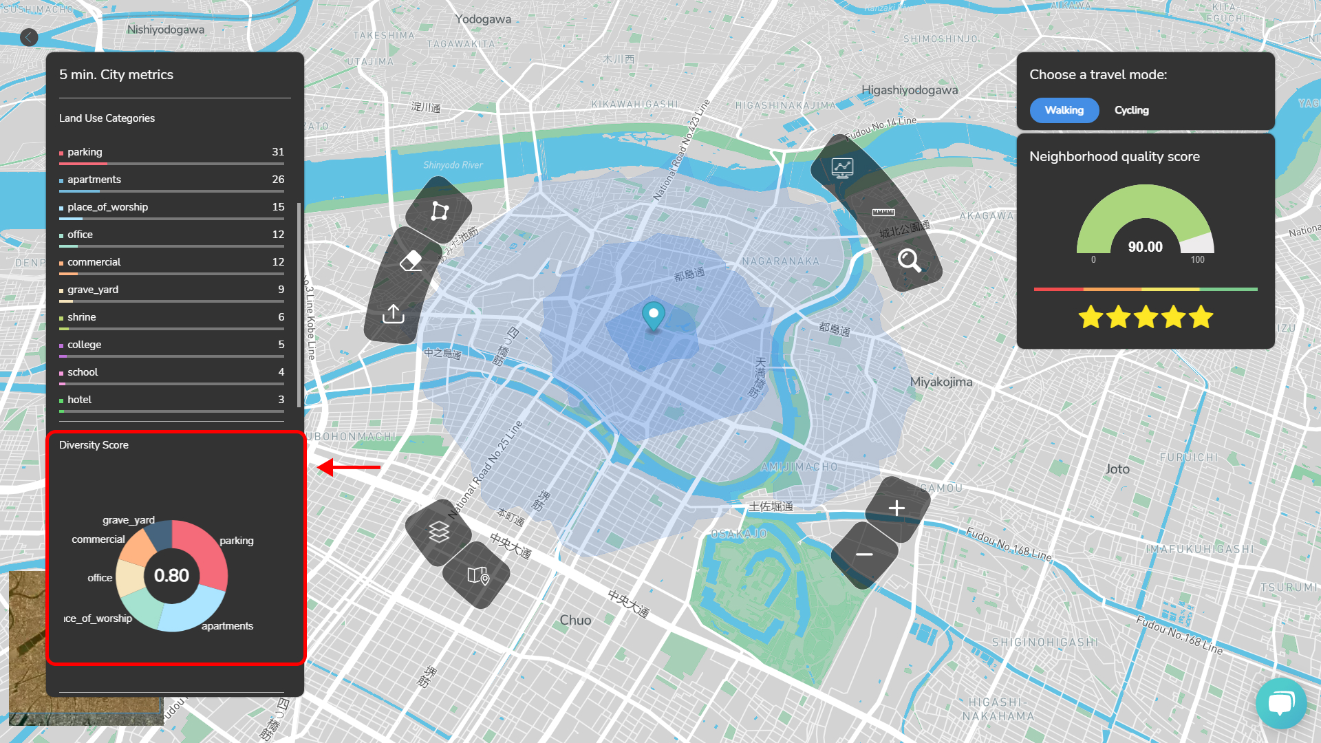
Diversity Score
You can visualize dominant programs within isochrones as pie chart, and gauge differences in the different neighborhoods of city using the score to understand the distribution of landuse mix.
